June 22, 2023
The Nation.
Preface
Home to tenacious muckraking, provocative commentary, and spirited debate about politics and culture, The Nation empowers readers to fight for justice and equality for all. By providing a deeper understanding of the world as it is—and as it could be—they drive bold ideas into the conversation and ignite debates far beyond their pages. ¶ Founded by abolitionists in 1865, they‘ve long believed that independent journalism has the capacity to bring about a more democratic and equitable world. Their writers shift paradigms and open minds. Their deep investigative reporting launches congressional hearings, forces policy change, and shapes news cycles. Instigating progress: It’s not only their legacy; it’s their continued commitment to future generations of torchbearers. 
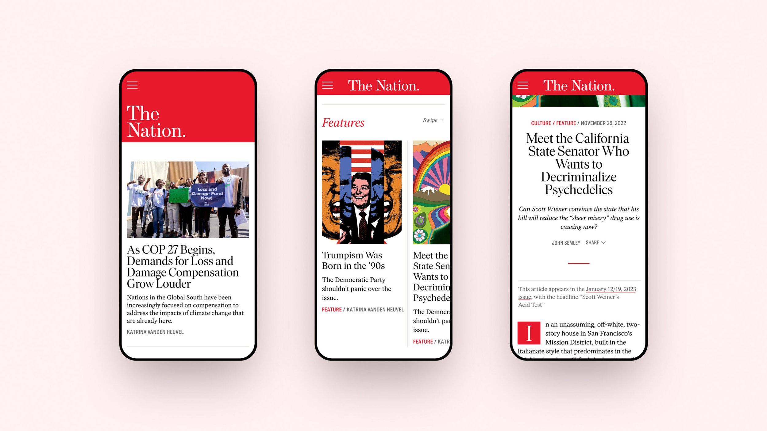
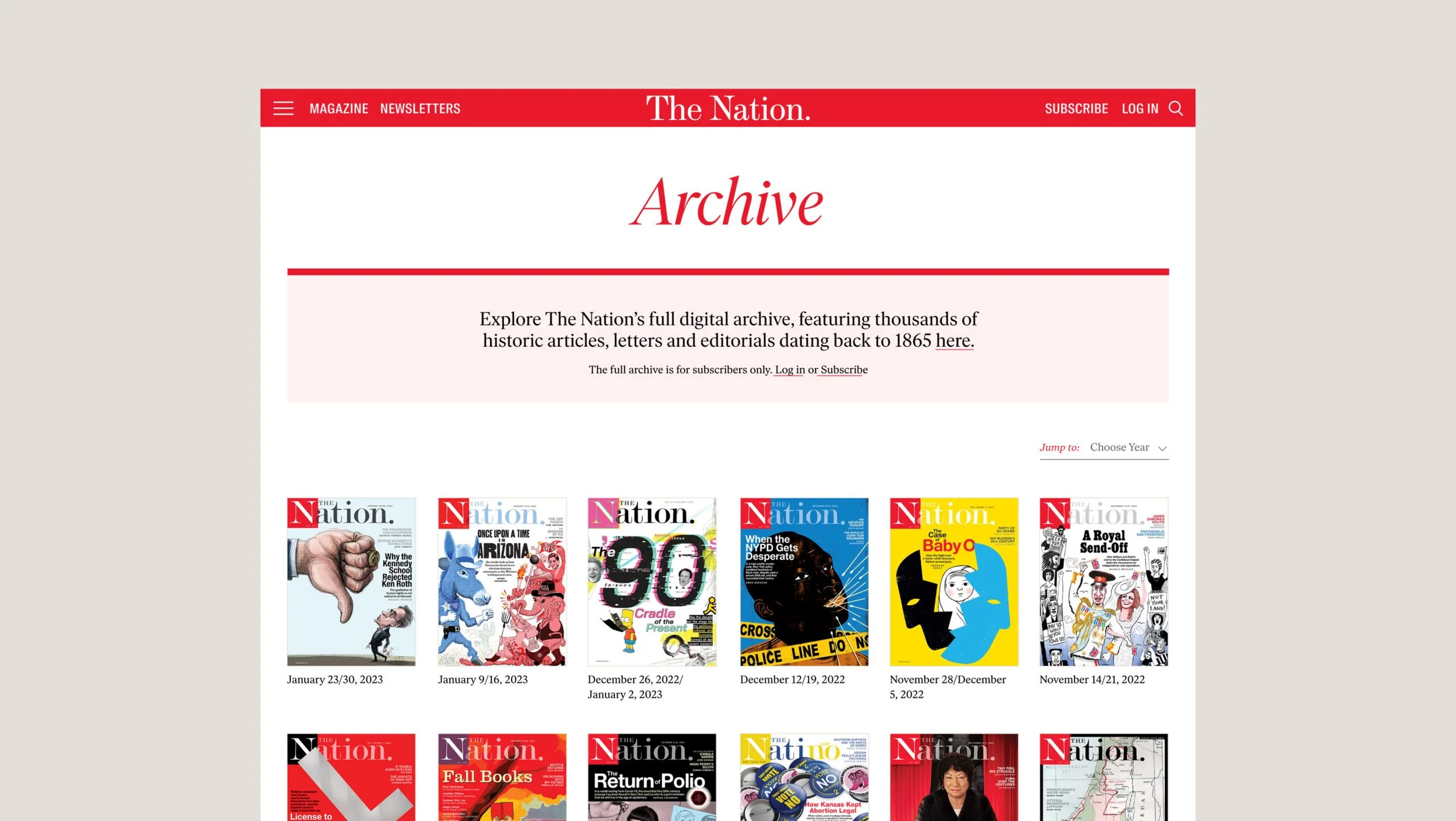
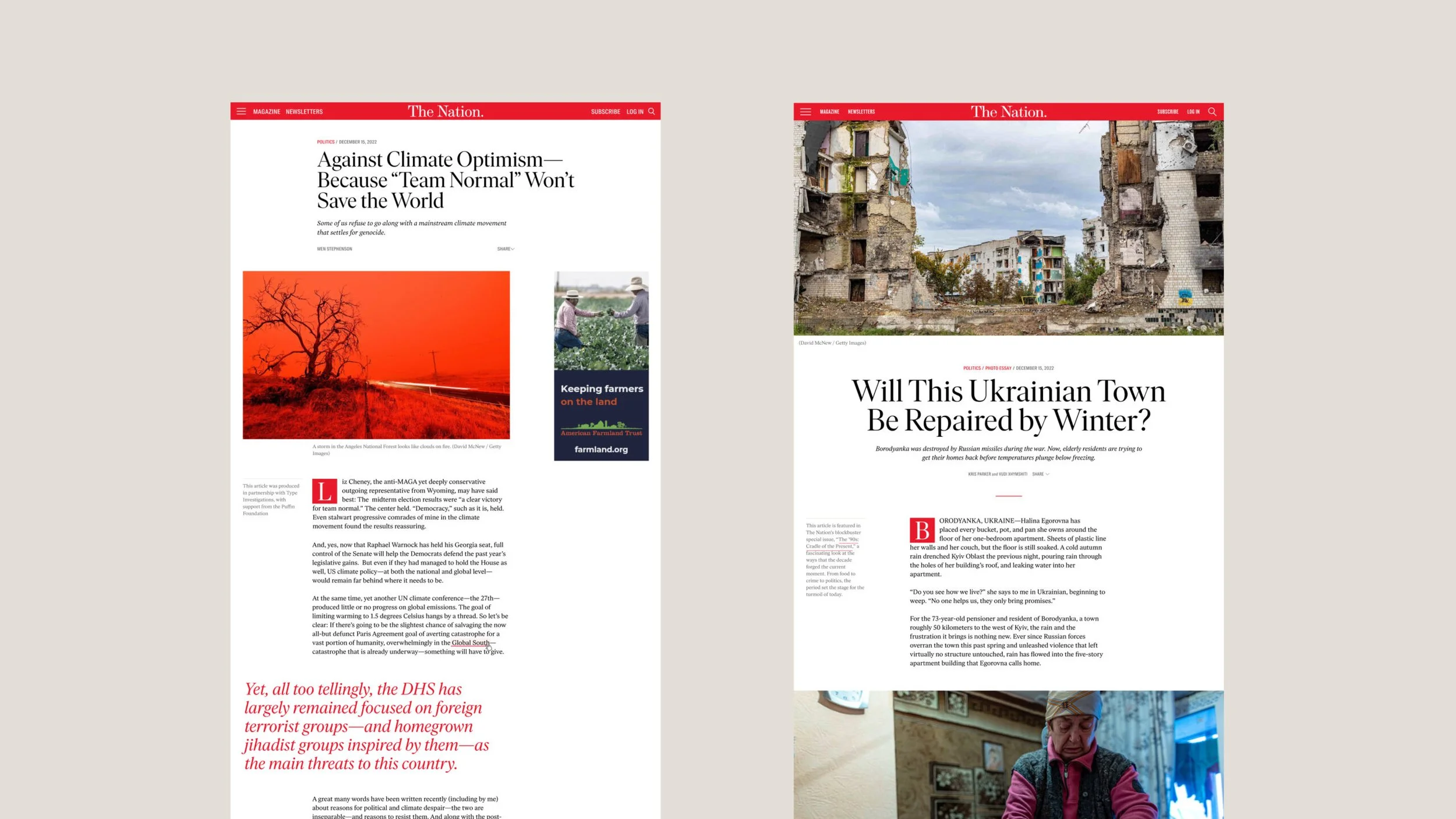
Nearly 160 after The Nation’s founding, it was time for not only a brand refresh but a redesign of TheNation.com. The Nation engaged Athletics to help reinforce and amplify The Nation’s position at the forefront of progressive political and cultural discourse through a modernized site experience and dynamic storytelling. The Nation’s intuitive and inviting editorial platform is designed to engage more deeply with new and existing users while celebrating its modernity and relevance. ¶ Athletics and The Nation worked with me to update The Nation’s wordmark to be more iconic and legible in digital formats while retaining a reference to its long history and original masthead. A flexible approach to the utilization of the word mark was developed to better accommodate responsiveness and scaling. 
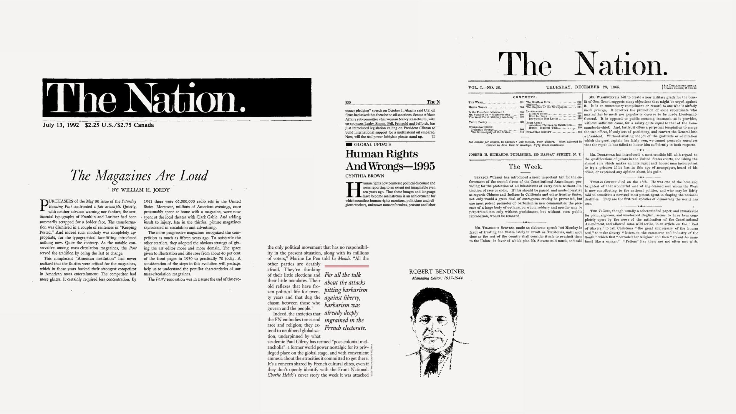
History of the Logo
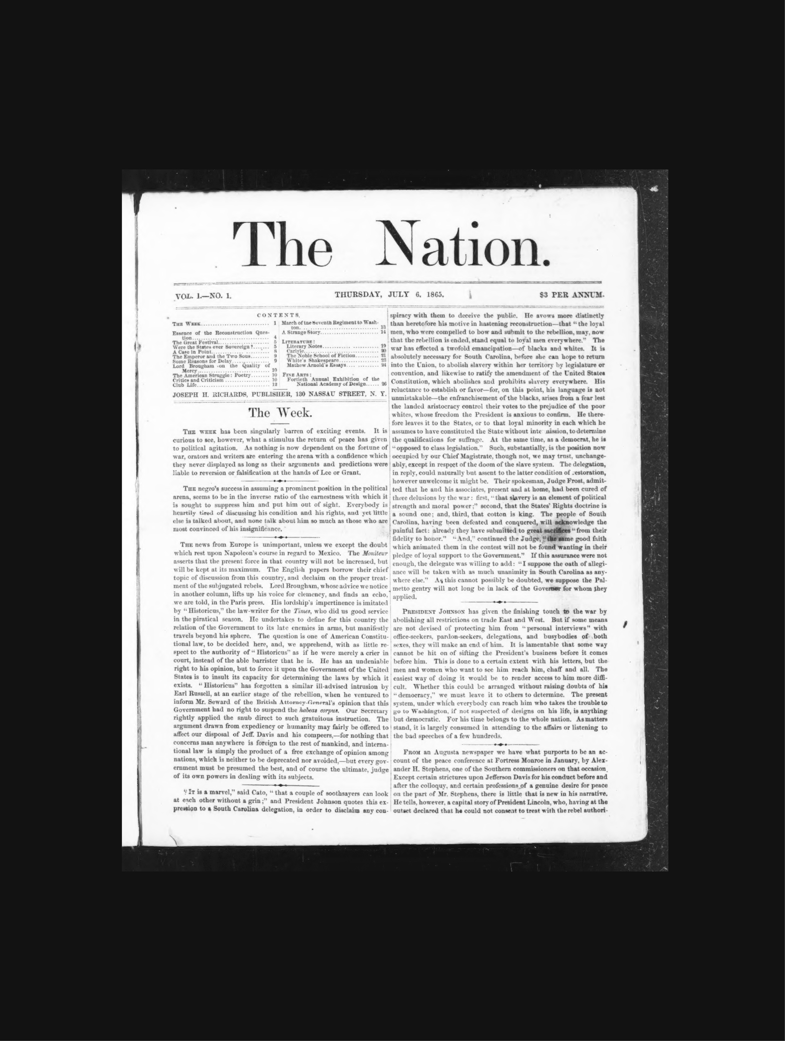
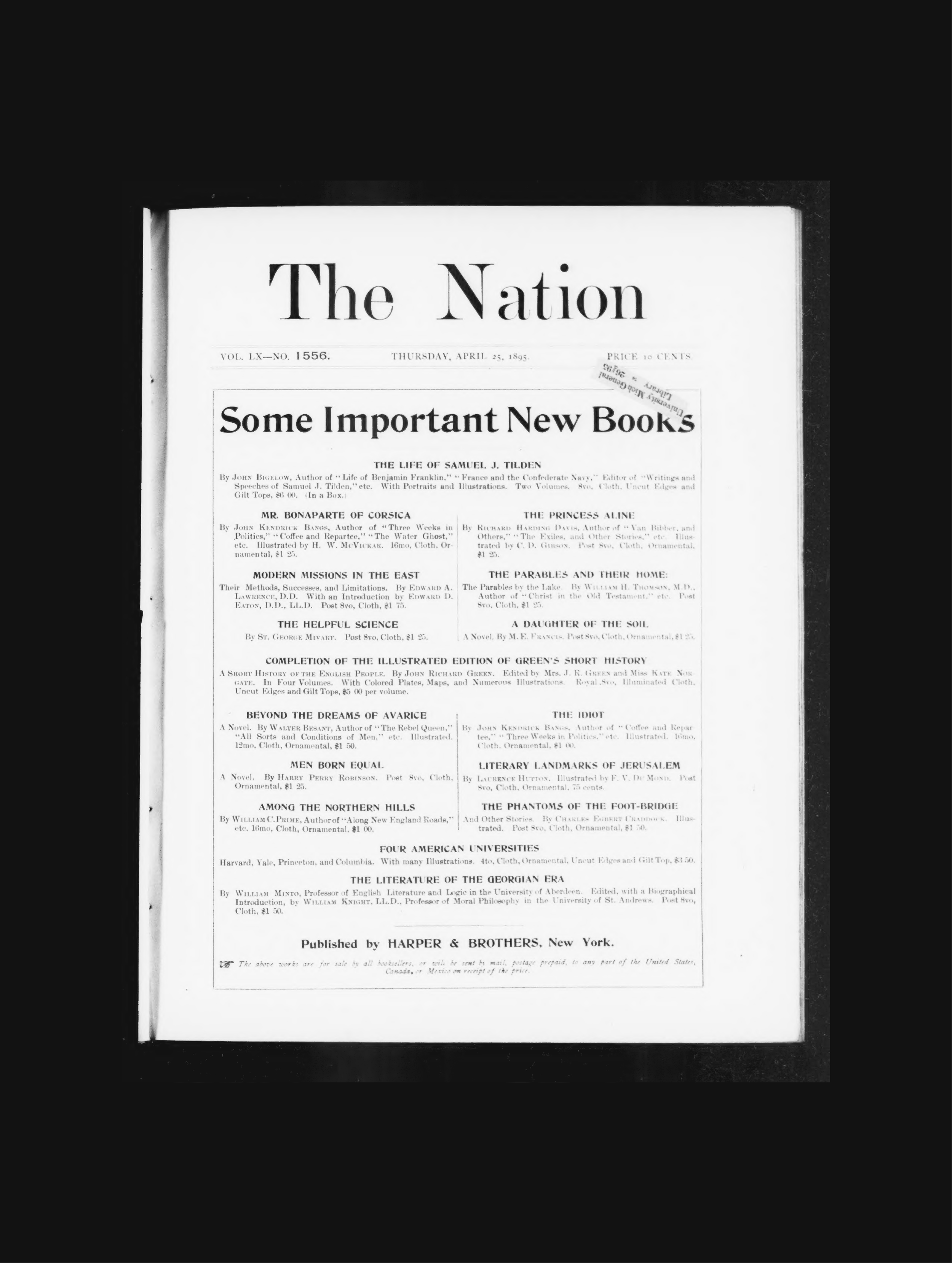
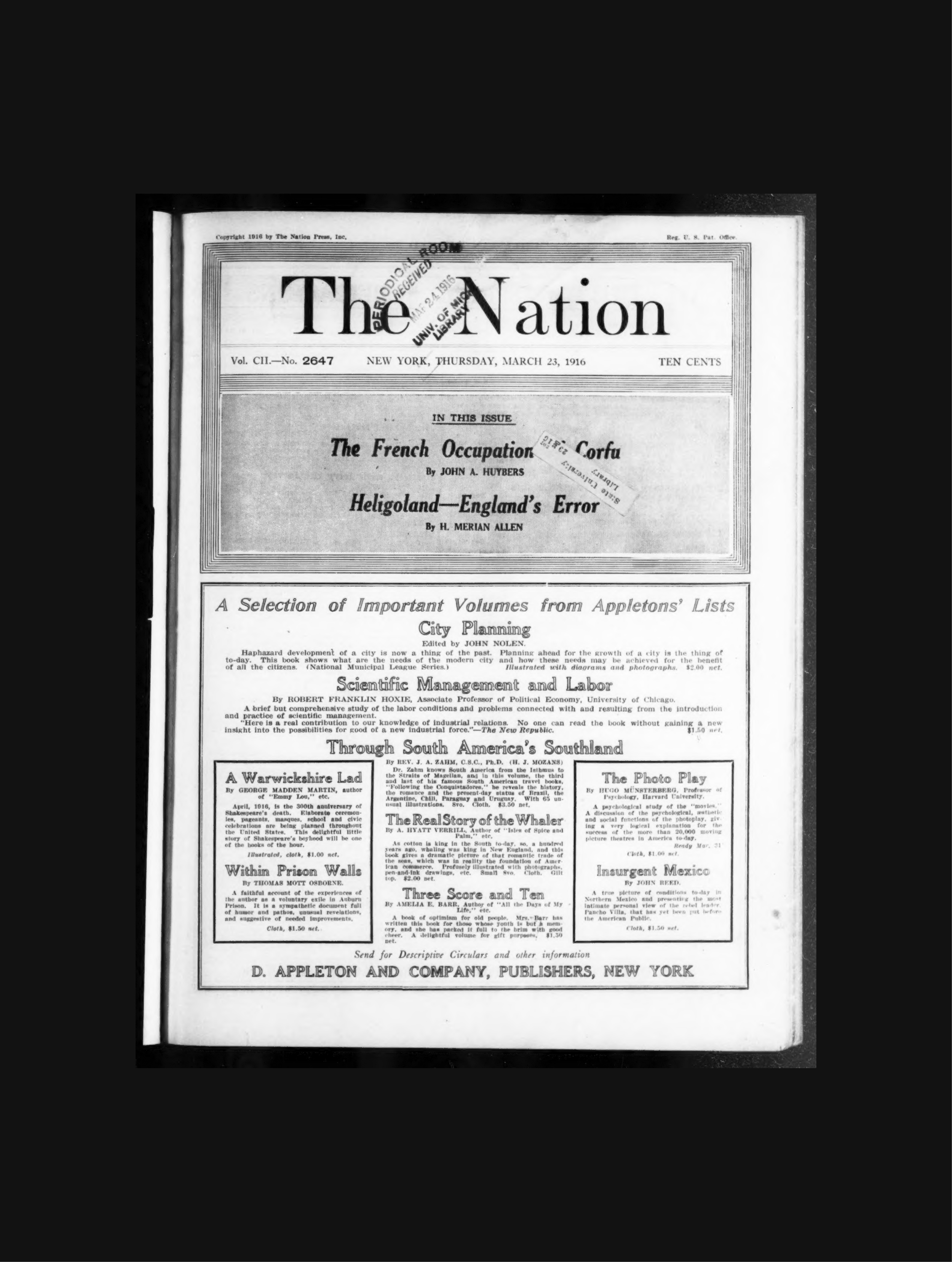
From what I can tell, The Nation used the same logo from their founding in 1865 to somewhere around the second quarter of 1916 (source). There have been over a dozen rebrands in the magazine's history, and it was time they had a series of wordmarks that honored their history with a contemporary spin. 
“As our country and the world undergo extraordinary and tectonic shifts, these times demand that The Nation be ever bolder, willing to unleash our imaginations and ready to think anew. ”
Katrina vanden Heuvel. Editorial Director & Publisher of The Nation
Updating the Wordmark
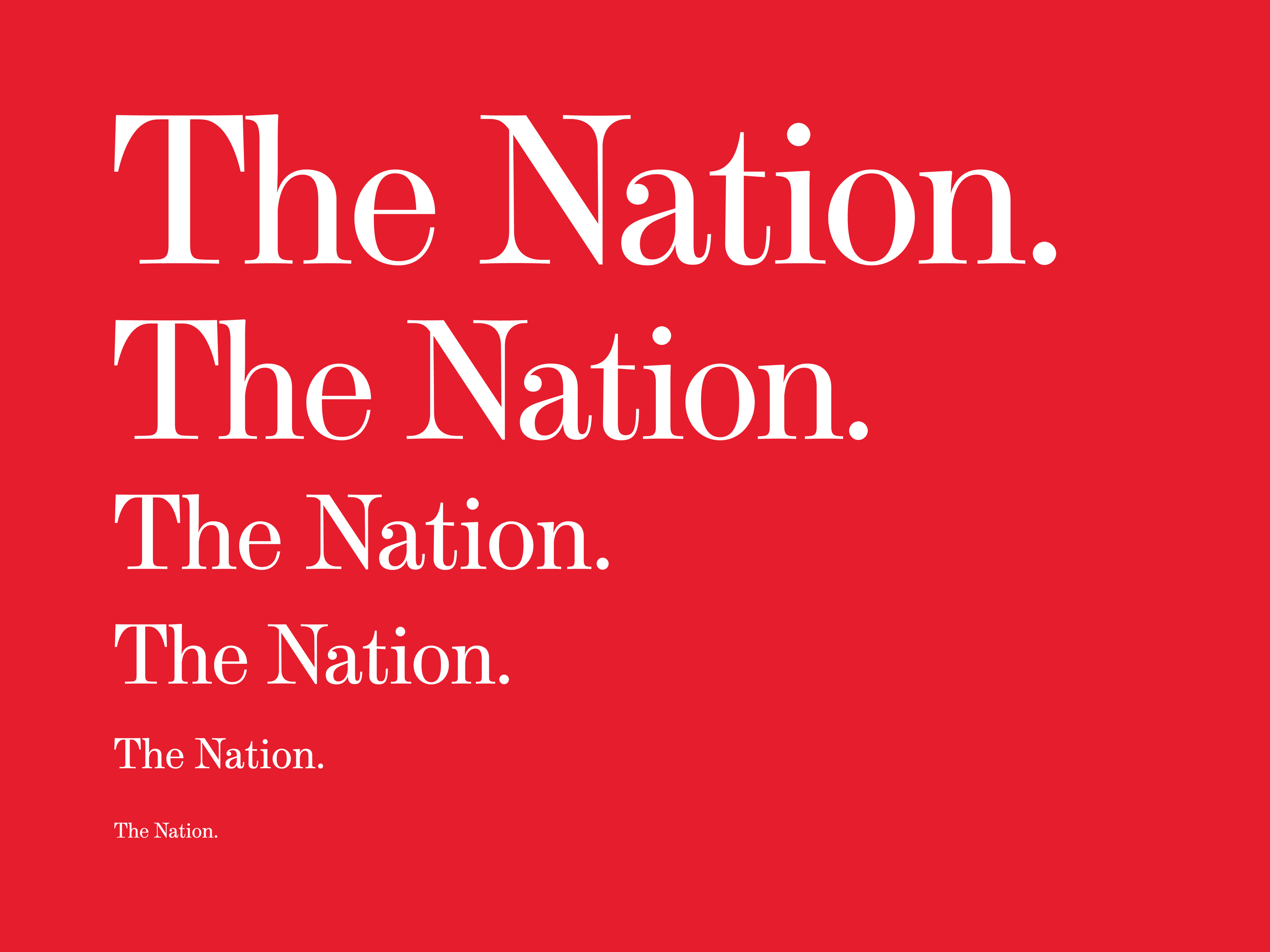
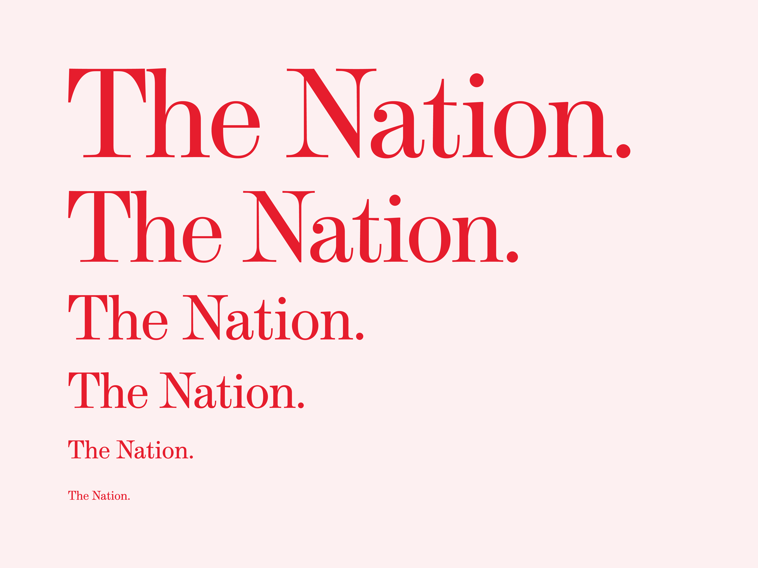
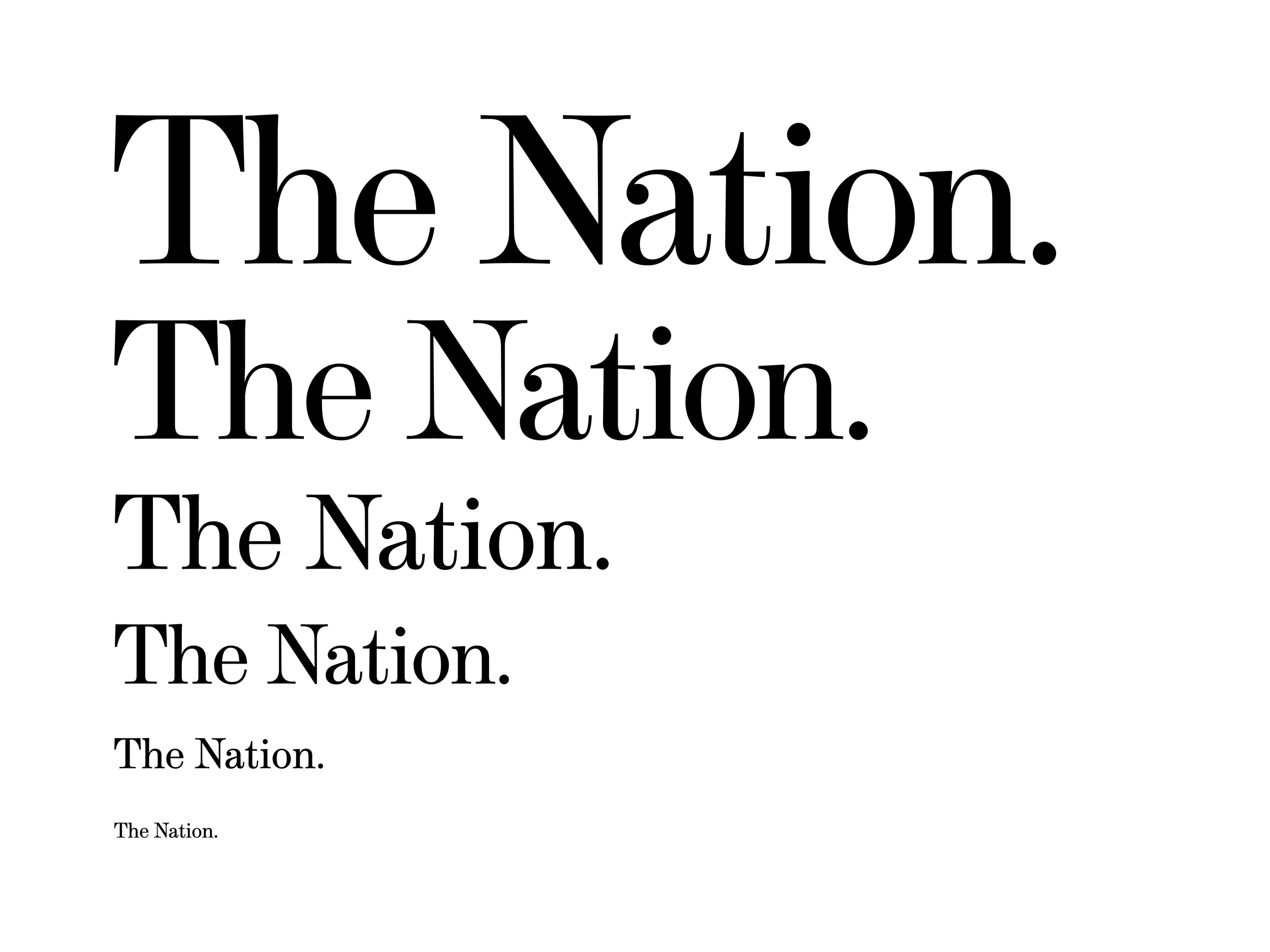
After a few months of work and 33 logo iterations later, here's where we landed. The largest change that had to be made involved synchronizing the weights of the characters so that they, optically, look similar. Prior to ~1960, many typefaces featured capital letters that were 2-3x bolder than the lowercase characters. Why that was, I can only speculate, but after the 1960s, this trend disappeared, possibly because it looked cleaner. 
Once everyone was happy with the base design, it was time to make a few variations. Each logo variation was designed for different sizes (optical sizing). As the letters in the logo get smaller, they need more space to breathe, and the thinnest portions need to get a tad bolder. This way, legibility isn't compromised regardless of how big or small the logo is applied. 


The Wordmarks In Use
Once the wordmarks were finalized, The Nation engaged Athletics to help reinforce and amplify The Nation’s position at the forefront of progressive political and cultural discourse through a modernized site experience and dynamic storytelling. The Nation’s intuitive and inviting editorial platform is designed to engage more deeply with new and existing users while celebrating its modernity and relevance. This encompassed re-envisioning The Nation’s brand behaviors for digital while improving user journeys, and taxonomies, simplifying article types, and increasing subscriptions and conversion. 
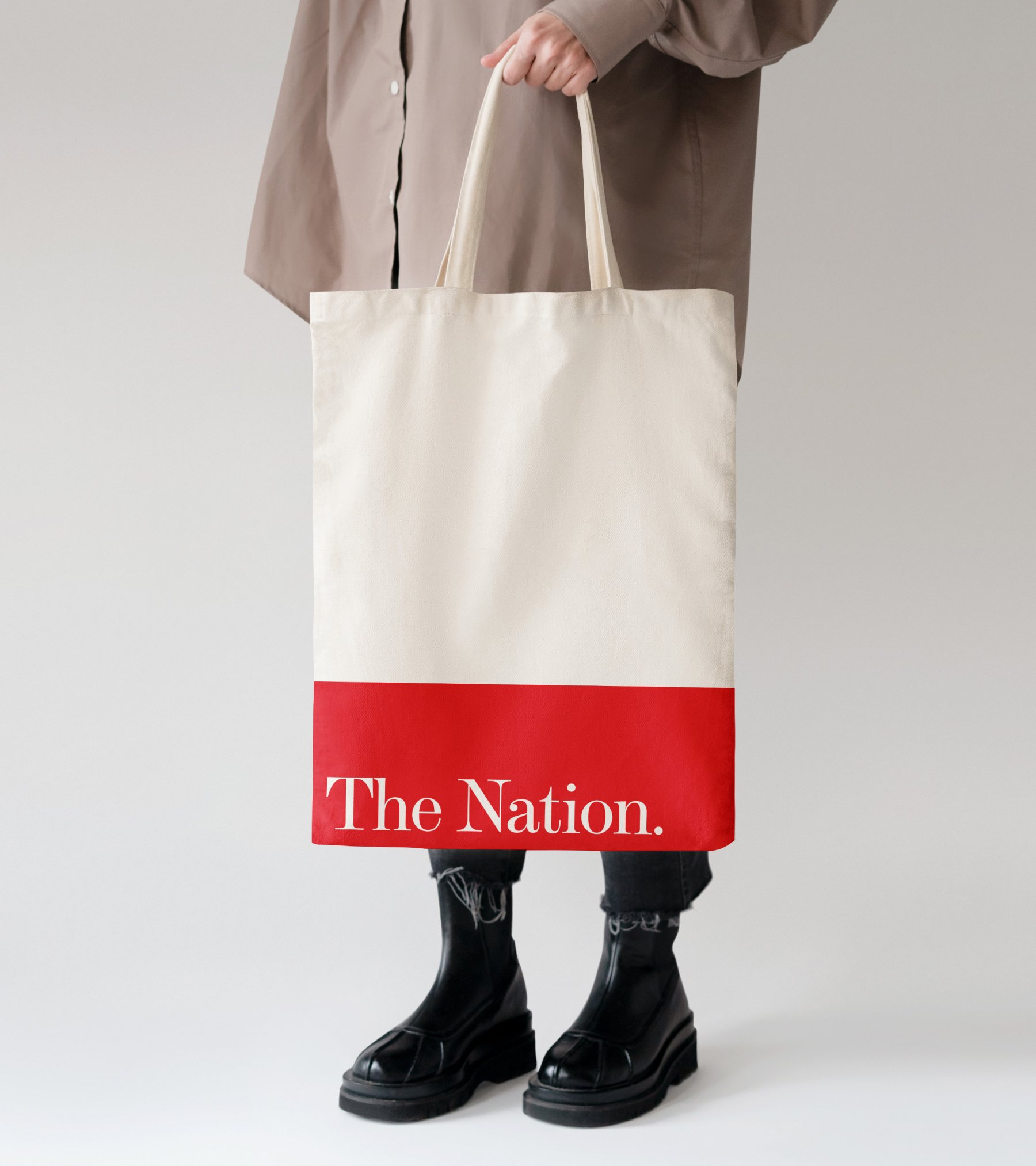
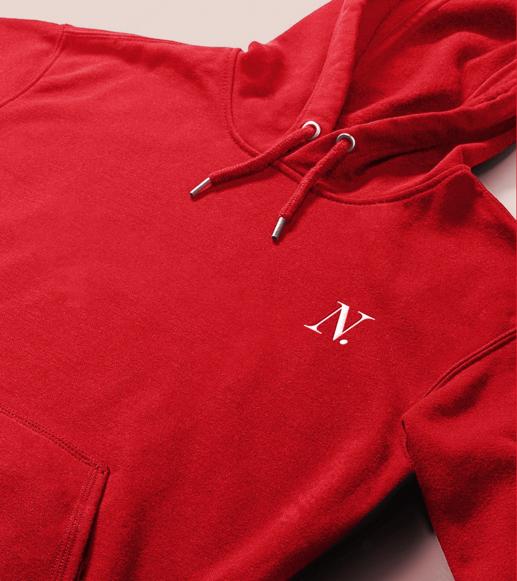
In the process of developing The Nation’s site experience, Athletics explored how the Nation brand could be expressed beyond digital. The Nation’s refreshed word mark is a strong, elegant, and timeless expression of its mission: The Nation speaks truth to power to build a more just society. 
Images courtesy of Athletics
PARTNER(S):
TIMELINE:
08.2021—10.2021
LAUNCH DATE:
08.2022
SERVICE(S):
Fashion
Identity
Typography
NOTE(S):
Featured on Creative Boom, Communication Arts, Graphic Design USA, and Site Inspire.